“ I Am Visual Interpreter a Ocular Problem Solver. An Artist who will Easily & Blissfully Accommodate Your Visual Needs! I’m a Professional in the areas of Graphic Design,
Branding, Advertising, Photography, Illustration, Signmaking, Printmaking & Image Editing...”
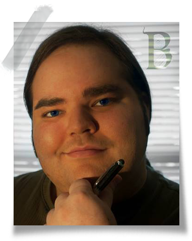
Myke Borello is an American Artist and Design Professional hailing from New York words used to best describe Myke are: imaginative, passionate, meticulous, bold, innovative, kind, artistic, selfless, unworldly, prudent, intuitive, fun, enthusiastic, and sympathetic. Borello’s interests include the fine arts, innovative design, music, history, science, pop-culture, electronics and technology.
Borello is an alumni of The High School of Art & Design . Where he began and excelled in his Career in the Arts. Myke took an interest in graphic design after his first job at eMerging iMage co . While earning his degree at The Art Institute of New York City. Post graduation Borello opened the Electric Artistry studio You are visiting today! With over a decade of experience, Myke Borello provides for individuals and business alike with unparalleled design and post production services.
© Myke Borello’s Electric Artistry 2015, All Rights Reserved.
Click slide for Demonstration


For my brother Anthony, who taught me to be proud to be an individual.
No matter what society may think.
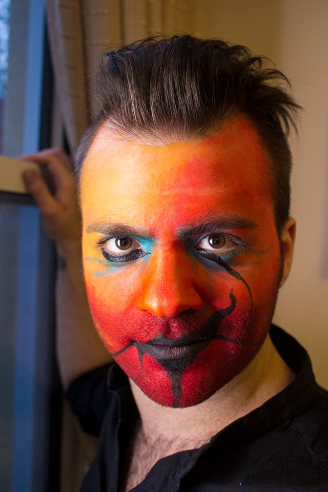
The objective in this piece was to illustrate one on the seven deadly sins, I chose gay Pride. The definition of love is an emotional attachment between two individuals. Is it a Sin to love? - I think not. For behold God did indeed create Adam and Steve!
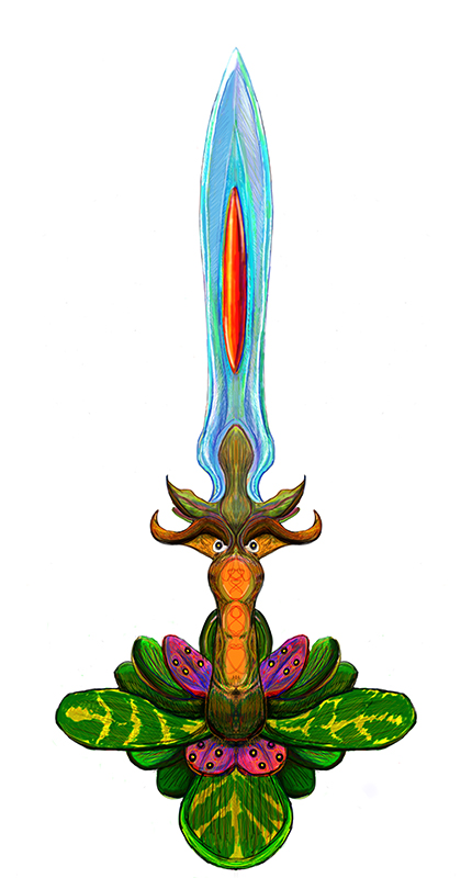
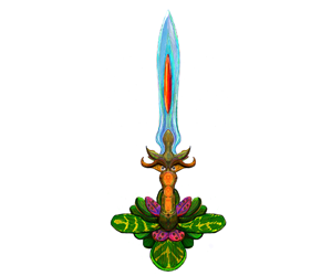
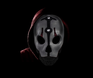
Started as scribble using the symmetry tool on Sketchbook pro. The scribble looked like a Celtic knot pattern so I ran with it, and it got my imagination going towards the concept of a mystical weapon that is not crafted but grown!

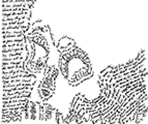
This is the final for my Typography class. The assignment was to find a quote, song lyric or poem and illustrate the moral or meaning of the passage.
The song lyric I chose was a Metallica song called "For Whom the Bell Tolls". - The lyric says, "Crack of dawn all is gone except the will to be, Now they see what will be blinded eyes to see."
The teeth of the skull are burning buildings, the silhouette of the skull is the smoke from the buildings, The nose is a atomic bomb and the eye sockets are blinded screams.
Dents Away is a mobile dent removal service based in Long Island New York, USA. The president of Dents Away is my cousin Kevin Doughty. As the name implies they can take care of dings and dents. what makes them unique is they will come to you! Fonts used in this piece are Tahoma and Brush Script. As you can see I have warped the word Dents and added a tire tread within the letter.
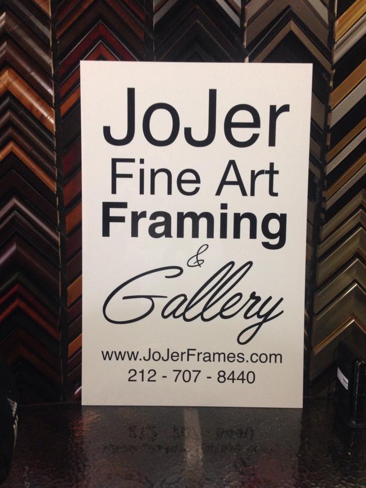
Introducing Kitty Bluefire's NEW Official Logo. Ms. Bluefire is an Artist, Gamer, and Cosplay enthusiast who specializes in miniature luminescent paintings, plushies, sculptures, and decorative baked goods!.
Currently Kitty has her works on exhibit at the JoJer gallery in NYC. If you're in the area I advise you to check it out! However if You are not in the NY area, you can see her Art here on deviantART.com www.kittybluefire1.deviantart.com .
She had hired me and my studio to create her brand identity. Needless to say we're both happy with the turnout.
Greenway Moving Systems is a client I picked up through a friend. The founder John Cali has started a moving company that is going green! This design gives the gist of what Mr. Cali does in a clear and legible image. (Probably why he chose this concept.)
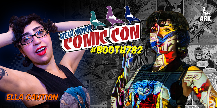
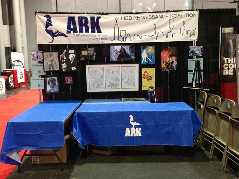
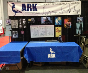
We are ARK, a group of diversified talents here to provide a world of opportunity while connecting people, through Art.
ARK stands for Allied Renaissance Koalition. We are a band of artists with a vision to bring art to a new level of life, and life to a new art form respectively. Together, Gallery Leaders Ramon Trif, Eddie Soto and Myke Borello coordinate projects, galleries and other creative opportunities to artists abroad! With real life experience and quality service, you won't be disappointed with the elite artistry at ARK! We promise to gather and take flight through our collective efforts and achievements
Dark, Gritty yet elegant. Concept three personifies the carrier pigeon as told in Noah's Ark as a NYC pigeon over the historically inaccurate dove depicted in bible stories. (Real Talk!) In the story of Noah's Ark, Noah knew that the waters had subsided when his carrier pigeon returned to him with an olive branch. That being said an ad for this idea would be the pigeon making a nest not out of olive branches but paint brushes and/or other various art supplies - As the moon in the background rotates reveling that it is actually an eye in the sky! The relevance of this logo to us is how were going to use our tools to bring art and enlightenment to everywhere we put on a show. Much like how the olive branch in noah's story brought hope. The moon/eye represents our audience. Potential background music would be 2pac's all eyes on me.

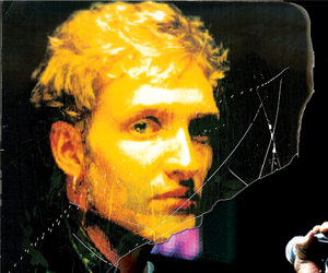
This is an image manipulation of Lane Staley, the Legendary former lead singer of Seattle grunge band Alice in chains. In the piece I symbolically state that although Lane is no longer among us his music will live on with the band. Not to mention that the new singer has the Lane's vocal pattern and harmonization down pat. Hence why I merged Staley's image on to the body of new AIC lead singer, William DuVall.

For those who are not familiar May 4th 1977 was the original release date for the first Star Wars film. In recent year Star Wars fanatics have treated this day as a international holiday based on this film that inspires almost everyone who watches the movie.
The image you see before you is a portrait of Darth Nihilus. A Lord of the Sith from the expanded Star Wars Universe from the sequel to the hit Star Wars computer game, Knights Of The Old Republic.
He is neither man nor machine rather a twisted soul trapped between the realm of the living and the neither world of the force.

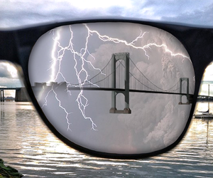
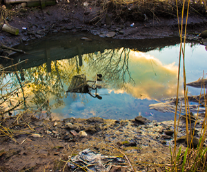
Imagine a world with no lithosphere or hydrosphere, This is what I have illustrated here. What you see is a photo taken of the Whitestone Bridge in Queens New York. Being a resident of Whitestone for many years, one of my favorite past times was to sit and look at this sight and day dream. What do you see when you let you imagination run free?
The above poster is a tribute to the best decade of Metal the 1980's. Typically there is more of a pop art Andy Warhol feel to these kind of posters. But as you can see I was going for the 1980's punk/metal scene. (As indicated by the Dio horns.)
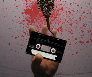
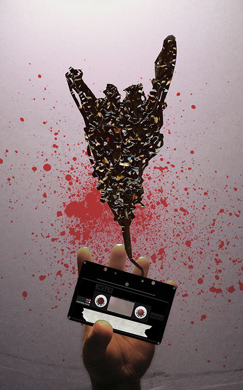
The cassette tape is a vector image composed in Adobe Illustrator. My hand gesture pays tribute to the legendary 1980 Judas Priest album British Steel. The blood splatter was for good measure. The fonts used in this poster are: Death Rattle and A Trip to Hell and Back.
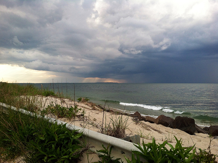
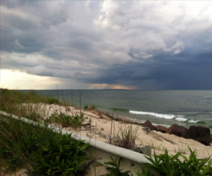
Recently I have decided to fine tune my skills in photography. This image is the 1st installment of my latest photo shoot where I challenge myself to use a cell phone camera to capture an awesome sight. This image was taken in Montauk New York, USA. My favorite part of this picture is the fact that you can actually see clear across the coast line of western Long Island.
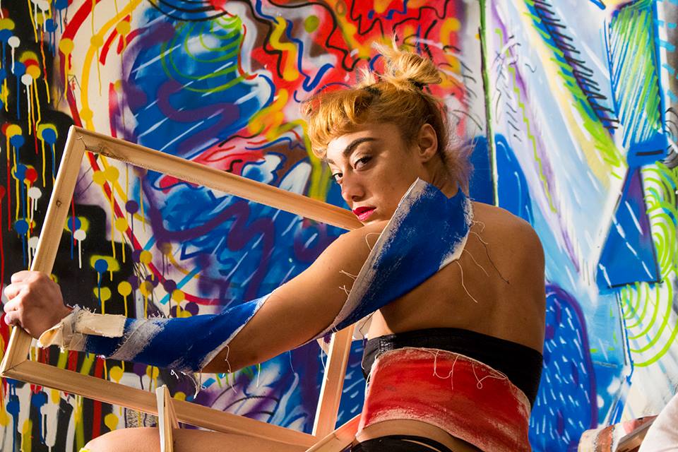
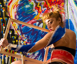
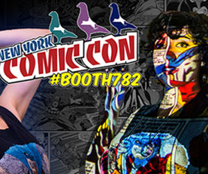
In this shoot professional photographer Eddie Soto & Myself travel to what is known as the Trap House in Queens NY to shoot our model Kiara Fernandez capture the full spectrum vision that is the talented Artists of #ProjectColorTheory. Soto had spearheaded this artistic endevor by filling the wall of the traphouse along side his team of professional artists.
The main purpose of an actor's head shot is identification. Therefore, the most important feature of an actor's head shot is that it represents the subject. Theatrical head shots are usually very "neutral" looking shots of the actor clearly showing their facial features.
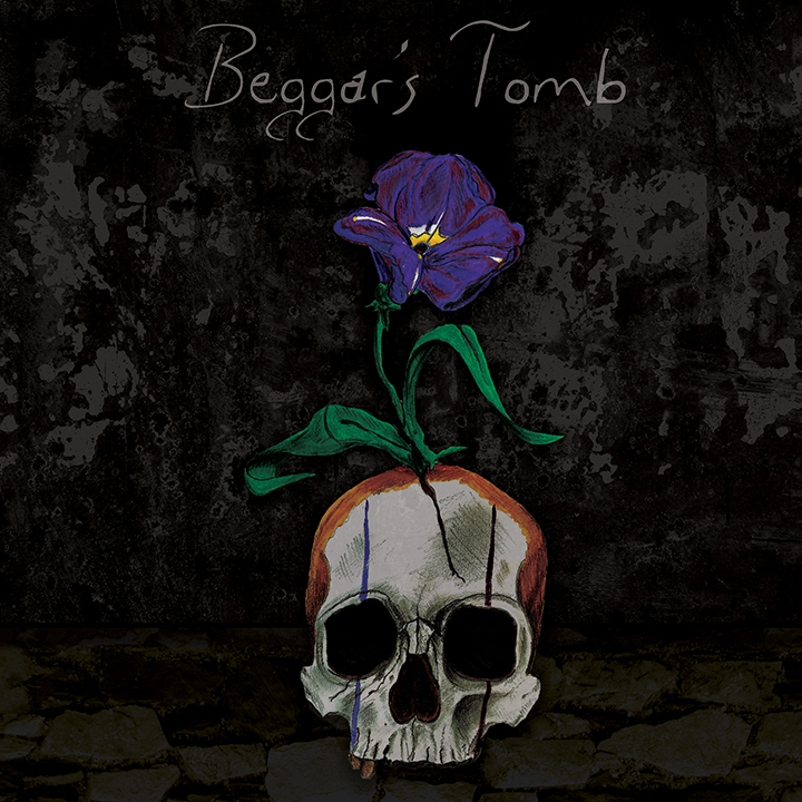
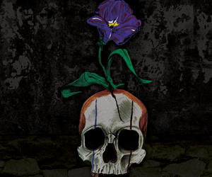
I present the album cover for my first band Beggar's Tomb. As you already know we never made it big, but those where some good times. The original line up consisted of my mentor Michael R. Bennett as our front man & lead guitar, Anthony Febrarro rhythm guitar, Andre Kuzmanovski bass guitar, and myself on Drums. Our sound was best described as distortion with an emotion.
The skull with flower was drawn in graphite, markers, and colored pencils. The fore and background were added digitally. I call this image the Beggar's headstone, due to the fact that a genuine beggar would most likely not have a proper burial, as well as push up their own daises so to speak. The red, white, and blue clown make up goes with the statistic that a good portion of the homeless in the US are veterans.
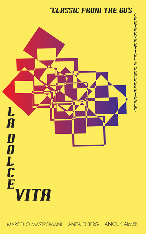
Here is my rendition of the 1960's controversial film La Dolce Vita, Which is Italian for "The Sweet Life". This movie poster is my tribute to the classic groundbreaking film staring, Marcello Mastroianni, Anita Ekberg and Anouk Aimee. The film was banned until the 1970's due to its adult content.

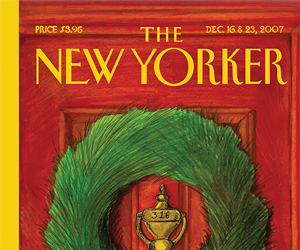
This is a submission to The New Yorker Magazine's December 2009 issue. You may be wondering why the bow on the Christmas wreath is yellow over red. - This pays tribute to our men and women in the armed forces. Especially those who are fighting abroad. The number on the door knocker refers to John 3:16 which reads, "And God loved the world so, he gave his only begotten son." I relate this passage to the families of our fallen soldiers who have heavily laid there sacrifice upon the alter of Freedom. It's their honor for which we still fight. Inspired by the film Johnny Got His Gun.
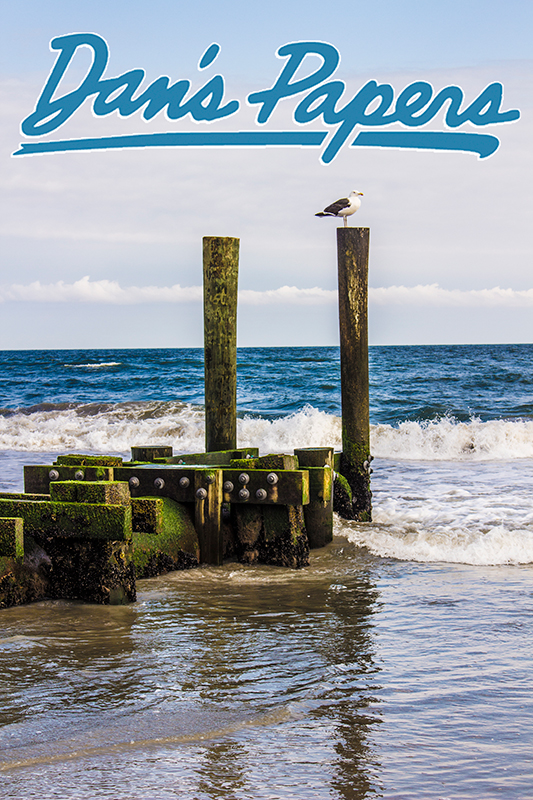
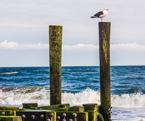
My Mother taught me how to read with articles of Dan's Papers. So I figured why not submit some of my Photography for the cover!? Not an Islander or not familiar with Dan or his Papers? - Check'em out:www.danspapers.com.

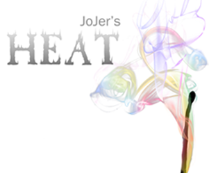
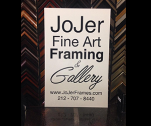
An event poster designed by Myke Borello's Electric Artistry for JoJer Fine Art Framing & Gallery's HEAT group artist exhibition. Exhibition open now through August 28th 2014. If Your are in the NYC area, come on down to Midtown and see ME as well as some of NY's best LIVE in HD and Technicolor with NO Watermarks!
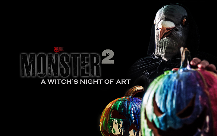
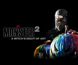
Flyer graphic design for ARK's 2nd Annual MONSTER 2 Art Show & Halloween Party taking place Devil's Night (Thursday October 30th 2014) @ DRAMATICS NYC on 34th Street in New York City.

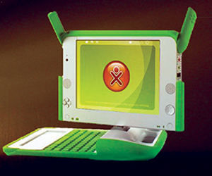
IHere is the second conceptual poster of the in store ads for the XO computer as part of One Laptop Per Child's campaign. This was piece is going back to when my team and I had our "key to the future" concept. An idea that was shot down by the creatives at BBH.
As you can see I have used a world famous quote as a grabber. The actual image is a spectrum of light though a keyhole illuminating an XO computer, as well as our key logo and tag line.t.
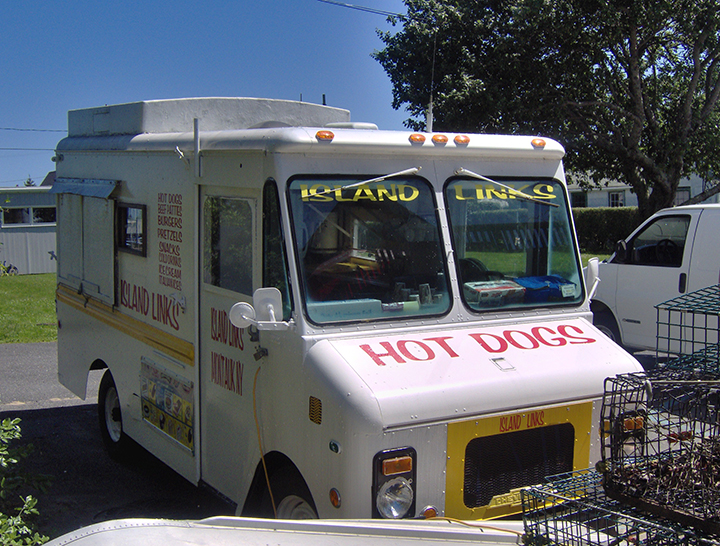
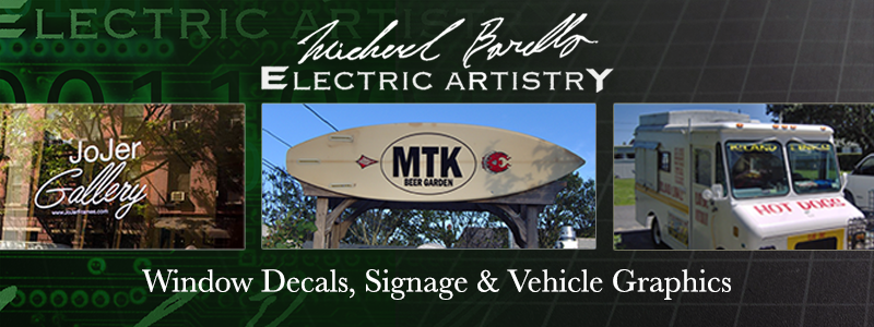
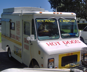
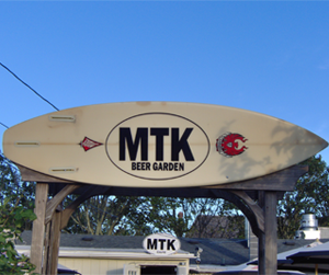
IThis signs is a past projects from my late brother in law's signage and vehicle graphics shop based in Montauk New York USA. I had created these signs using single color vinyl. The lettering on tuck are all handed place and picked by me
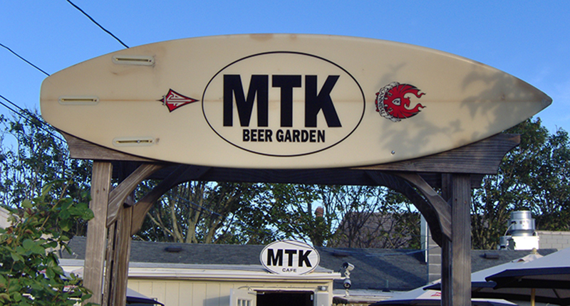
This signs is a past projects from my late brother in law's signage and vehicle graphics shop based in Montauk New York USA. I had created these signs using single color vinyl. The lettering on the sign are hand placed by me.